mybillbook Case study
Rebuilding myBillBook's interface and the design system behind it, end to end
This case study covers the period where myBillBook stopped feeling like one product.
I'll walk through why I decided to lead a full redesign, how I built a design system to back it, how we rolled it out without breaking the habits of millions of existing users, and what happened in the weeks after launch, both the parts that went well and the parts that didn't.
Identifying the ROOT cause
The problem I was looking at
Root Casue
Before we found whole bunch of issues, the first identifying cause was the inconsistency between design and engineering and years of accumulated design debt.
Feature Bloat As Product Scaled
With years of features added the product felt like it was patched on rather than one cohesive experience.
No Single Souce Of Truth
I'd put together a rudimentary design system and guidelines early on, which didn't last long against a team and product that were both growing
Component Drift
Old and new components sat side by side in the codebase from our v1 rework, engineer would resue whichever version was already wired up, to ship faster on schedule
Touch Points
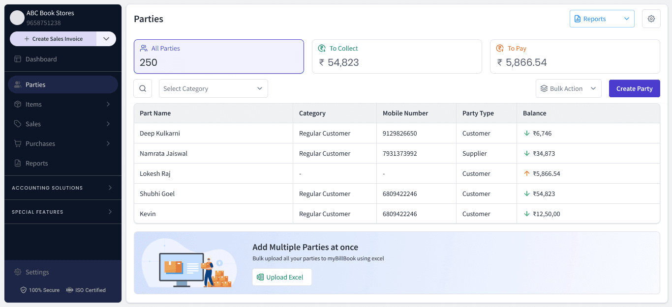
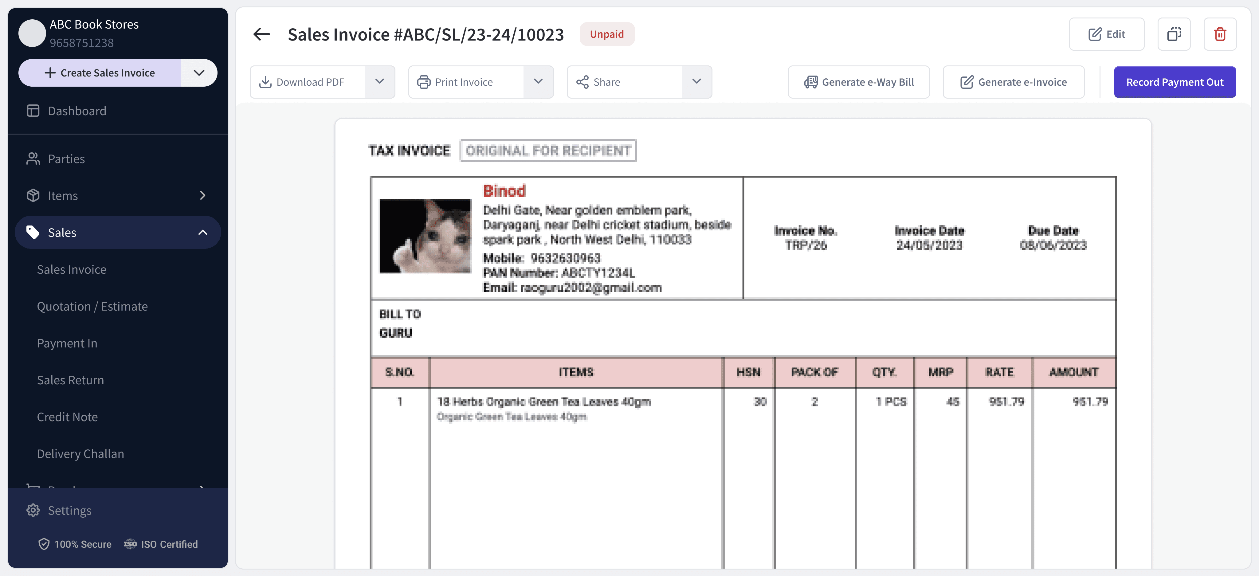
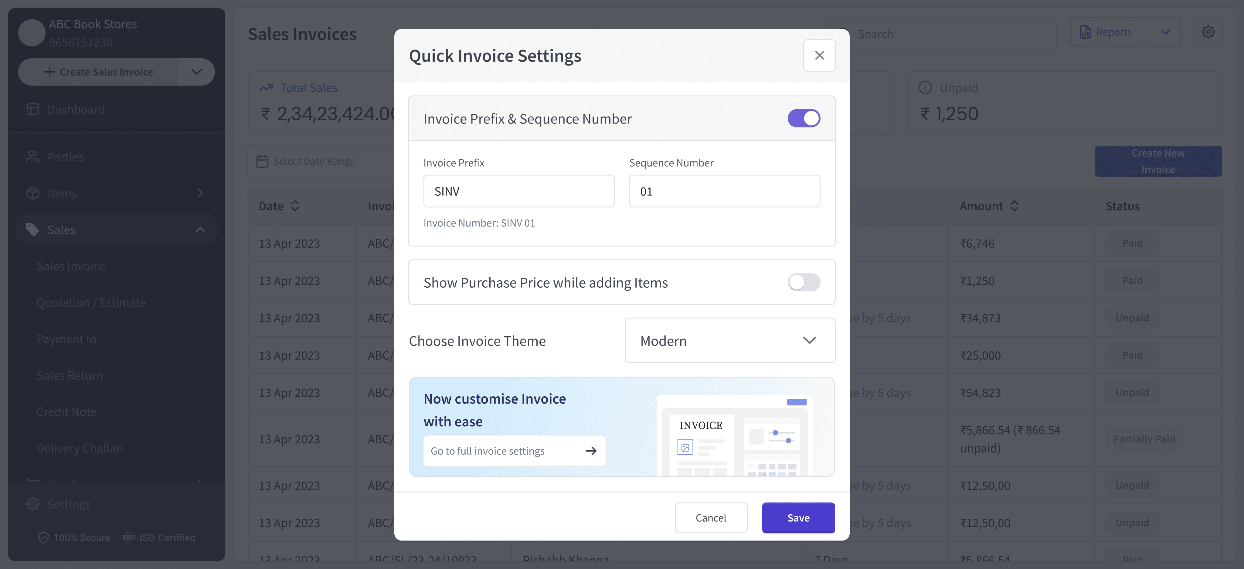
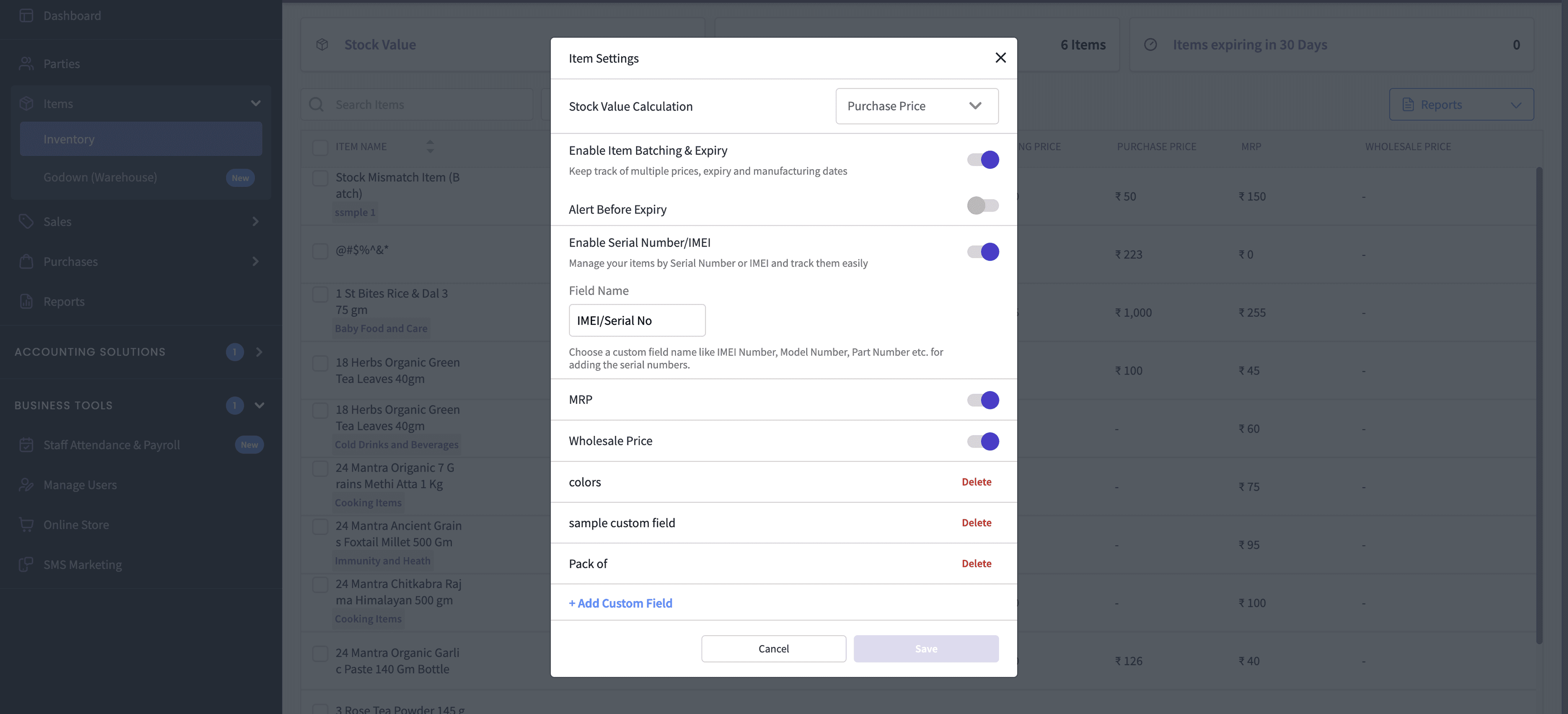
Items, Parties, Invoicing, Expenses, Reports, Staff Attendance & Payroll, SMS Marketing, every modal and table in the product
SNEAK PEAK
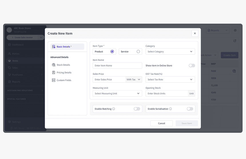
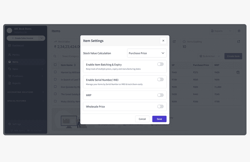
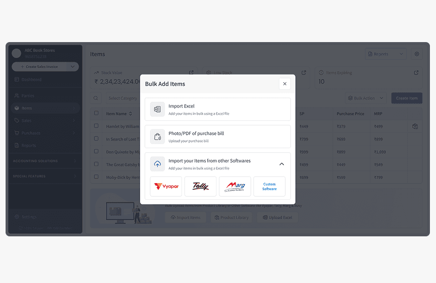
Before we talk about the process, here's final product at a glance.




Identifying the cause
The research
Before I touched a single screen, we needed proof of what else was broken. My team and I ran in-person usability research for our core features across four cities: Bangalore, Ranchi, Mumbai, and Delhi.
33 business owners · 4 cities · 5 segments - I went to Ranchi myself for part of this, sitting with business owners while they used the product live on their day to day system.


First-time users · FMCG · Hardware · Electronics · Services
Users were given real tasks to complete inside the live product: create an item, run a bulk edit, build an invoice, pull a report. We recorded exactly where they got stuck, and scored every step from 0 (needed to be told exactly what to do) to 2 (completed without help).
Reports were nearly invisible - Only 29% of users could find the reports screen on their own. FMCG users hit 0%.
Custom fields didn't register as a concept - People weren't confused by the flow, they didn't know what the term meant. Every single Electronics user we tested, all five, hit a complete dead end trying to add one.
Serialization was unusable for the exact users who needed it - Electronics sellers, the industry serialization was built for: not one of the five we tested completed it without help.
Bulk edit was undiscoverable - Only 3 of 33 users found it without help. Once they did, 90% of them managed to complete the upload.
A field nobody used got in the way of one everyone needed - Vehicle Number sat at 20% completion and slowed down the "Mark Fully Paid" step for users who didn't need it at all.


Reframing the problem
That data reshaped my read of the problem. Several of the worst failures traced back to vocabulary and information architecture rather than visual polish, which meant fixing them would require rewriting how features described themselves and where they lived in the product, not just how they looked.
Most importantly - How do we help a first-time user find what they need without being told, and get a power user past friction on flows they run every single day, without treating every screen as its own one-off fix?
Next steps
Scoping the work and getting alignment
The scope I landed on was bigger than a feature wise fix, it was possible to fix these individually but again, engineering and design would be on different pages without a foundational fix and our cumulative design debt would just grow.
Scope
What needs to be done
Preserve existing user muscle memory
By evolving familiar patterns where possible instead of forcing long-time users to relearn the product
Rebuild the visual and component system from the ground up
To create a consistent and solid foundation for the redesign
Create a single source of truth for design and engineering
Bringing components, patterns, and specifications into one system to prevent design and implementation drift
Roll out the redesign systematically
Starting with the highest-impact workflows and expanding the new system across the product.
Use the redesign to establish reusable patterns
So future features can be designed and built consistently rather than introducing new one-off solutions.
Defining the Direction
Setting clear goals upfront would give the redesign a focused direction
Primary Goals -
Create one reliable version of every component
Consolidate the existing component variations into a clear, documented system so engineers always know which component to use and designers aren't solving the same interaction in different ways.
Address the discoverability issues identified in research
Prioritise the workflows where users struggled to find or understand key functionality, including reports, bulk edit, and custom fields. Each of these areas should have a clear entry point and a more predictable interaction.
Establish a shared source of truth for design and engineering
Bring components, states, patterns, and usage guidelines into one system that both teams can reference throughout the redesign and implementation.
Secondary Goals -
Build a system other designers can extend independently
Document the decisions and patterns well enough that new features can use the existing system without requiring constant design direction from me.
Reduce the QA surface area with reusable patterns
Removing duplicate component paths should make implementations more consistent and reduce the number of variations engineering needs to account for and test with each release
Create a foundation for future product work
The system should make it easier to introduce new features while keeping the product visually and behaviourally consistent as it continues to grow
THE CONSTRAINTS
The redesign had to work within an existing product, existing habits
Established user habits
Millions of paid users were already familiar with the existing interface. Changes had to improve the experience while preserving the mental models and workflows people relied on every day
Design system from zero
There was no existing system to build on. I had to define the foundations, components, naming conventions, and usage patterns while continuing to support regular product work
High-stakes rollout
A major visual change could affect user confidence and retention. The redesign needed to be introduced in stages, allowing us to monitor the impact and reverse individual changes when necessary
Existing product had to keep moving
The redesign was happening alongside ongoing feature development. The new system had to work within the pace of the product rather than becoming a separate design exercise that could only be adopted later.
Know what to change and what to protect
Before changing an existing workflow, I needed to understand what was already working well. The redesign had to separate genuine usability problems from patterns users had already adopted successfully, so we could improve the weak points without accidentally disrupting behaviours that were already effective.
Mandatory questions
We asked ourselves these questions
"Which screens do we touch first to validate the system without risking the core flow?"
"How much of the old visual language do we keep so existing users aren't lost overnight?"
"Where's the line between fixing a usability issue and rebuilding the whole system?"
"How do we get engineering to reach for the new component by default, not the old one?"
BUILDING THE SYSTEM
I built the foundation around evidence, consistency, and reuse.
Audit every component against research
Before changing a screen, I audited the existing components against the usability findings and product requirements. This helped me distinguish between patterns that genuinely needed to change and patterns that were already working well for users.
Start with the foundations
I started with colour, contrast, typography, spacing, and other core tokens. The 2022 usability work had identified persistent issues around visual clarity, so these became the first layer of the new system.

Create one reliable version of every component
I consolidated duplicate component variations and defined consistent states, behaviours, and usage rules. The goal was to make the right component obvious to both designers and engineers, while also ensuring that any new components introduced in the future would naturally inherit the same visual and interaction language and still feel like part of the same system.

Define a shared language
I established common naming, spacing, and component conventions so that a component created by one designer could be understood and extended by another without having to decode how it was originally built.
Bring design and engineering onto the same source of truth
I structured the system so design and engineering could work from the same definitions and specifications. This reduced the drift that had previously appeared between the design files and the implemented product.
APPLYING THE SYSTEM
Once the foundation was in place, I used it to redesign the workflows.
Here's a side by side look at some of the core screens, old on the left, new on the right. The visual change is obvious, but the more important change is underneath it, every page has the same token and component system now.