mybillbook Case study
How my 5-year journey designing myBillBook impacted over 1 crore+ small business owners
myBillBook started as a simple Android MVP. It had validated the idea, but it was still an early product with a handful of screens and very little design behind it.
As the company decided to invest in it, I transitioned onto the product and took ownership of the design.
I was responsible for everything beyond the original MVP. I designed the web application from scratch, led the UX for the desktop app, POS and online store, and shaped the Android experience.
#mybillbook
Scope of this case study
Core problem: Usability and legibility
This case study focuses on my work from myBillBook's early product stage through the 2022 usability rework, where we identified fundamental UX issues through research and significantly improved product adoption.
It covers the product's evolution from early stage webapp into a multi-level experience, the research that reshaped our assumptions, and the decisions behind the first major UX overhaul.
2023 is where this gets bigger than one designer: a full redesign, a design system that scaled with the team, and one that finally kept design and engineering in sync.
The work is documented separately, that's the deeper read if you want to see how this scaled into what's now used by crores of businesses. If you're short on time, that's the one to read.
Read the 2023 redesign →
SNEAK PEAK
Before we talk about the process, here's final product at a glance.


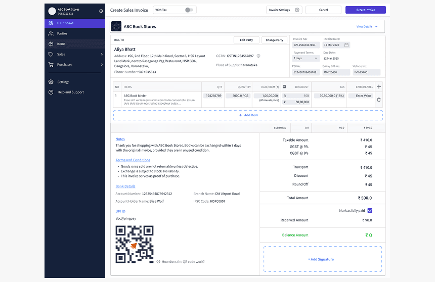


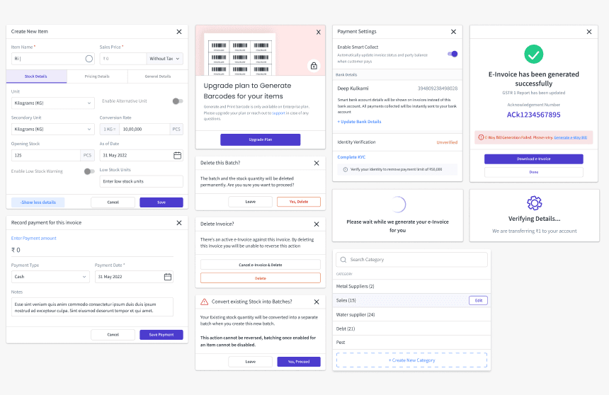
Building for bHarath
Shaping How India's Small Businesses Run
The Gap
In 2017, India introduced GST — one of the biggest tax reforms in the country's history. For large businesses with accounting teams, this was manageable. For India's 63 million small businesses, it was a difficult problem to solve.
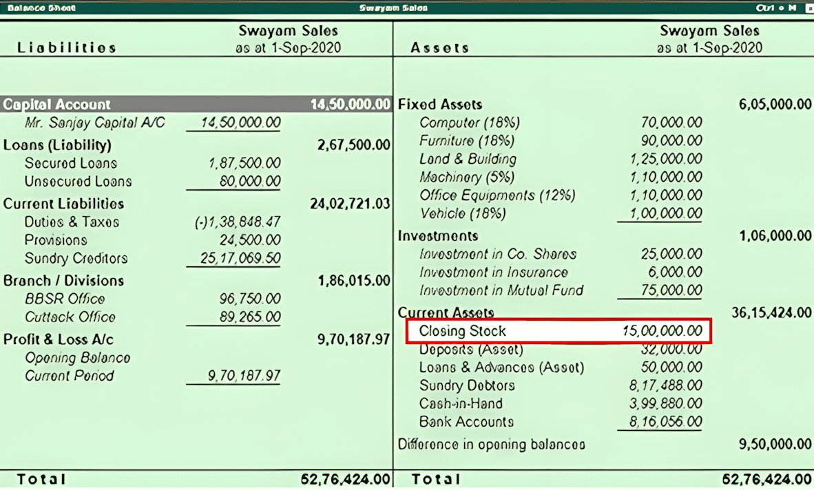
Tally —
was built for accountants, not owners. To get anything useful out of it you needed to hire a dedicated person or take a course. Want your balance sheet? Ask your CA. It ran only on desktop — locking out every business without a computer.
Vyapar —
had the right instinct but poor execution. Weak UX, high pricing, no cloud sync, desktop fully paywalled.
Paper billing —
the reality for the majority. Fast and familiar. But invisible to GST, impossible to reconcile at scale, and completely manual.


What we set to do
Make digital billing as easy as sending a WhatsApp message.
We built our design foundation on four core principles: Visually clean but frictionless UX, zero cognitive load (no accounting knowledge required), an accessible entry point, and rapid time-to-value. Creating a bill had to take fewer steps than writing one by hand.
But…
Adapting non tech people to use an app for a task they had done by hand for years… wasn't that easy as we thought…
Who We Were Building For
Our user base was incredibly diverse. On one end of the spectrum, we had 25-year-old tech-savvy. On the other end, we had 60-year-old shop owners
We grouped our users into three main personas:

The Power User
Highly tech-savvy. They explore new software easily, read the interface quickly, and want to move fast.

The Guided User
Comfortable with basic apps, but easily overwhelmed by cluttered screens, small buttons. They need the interface to be obvious.

The First-Timer
Zero exposure to business software. They rely entirely on physical ledgers and local vocabulary, and need the absolute lowest entry point.
This created a massive design challenge
How do you build an interface that holds the hand of a beginner without frustrating a power user?
If we made the app too complex, our first-timers would be overwhelmed and might abandon it. But if we over-simplified it by forcing users through annoying, unskippable tutorials or excessive hand holding, our power users would feel slowed down by it.
Our solution was progressive disclosure. We kept the surface layer simple. The primary actions focused on what user needed the most, Make an Invoice. However, we kept the advanced, neatly tucked away just a tap or two deeper.
And, since most of our users were coming straight from pen and paper, we kept the copy straightforward and just used the words they are familar with.
"We made the platform incredibly easy to start using, but gave it enough depth to scale alongside the user as they became more confident."
Version 1
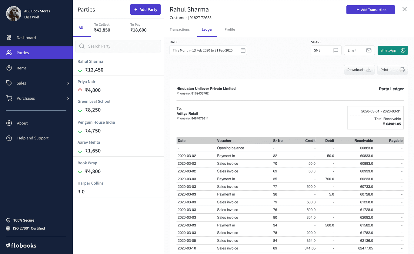
Clean, intuitive, modern, and designed with the best intentions
We launched an interface that we truly believed was effortless to use.
(Note: myBillBook was called Flobooks in the early stages)



WHAT WE DISCOVERED
The design worked for us. Just not for our actual users.
A few months in, something wasn't right. Support tickets kept repeating the same themes. I started watching SmartLook recordings, hours of them and saw the same thing over and over. Users hesitating, clicking the wrong thing, missing features that were right there. So I picked up the phone and started calling users, writing down everything they said.
The calls gave me mixed feedback, pieces that didn't add to what I was looking at in my screen.
All the information is cluttered, scattered and hard to read
There are no lines to differentiate between sections
I don't know where to click
Lots of missing functionalities and features
Features are incomplete

But I couldn't put it together from recordings and calls alone.
So my Team and I decided to go see for ourselves.


We visited actual users in Bangalore. I sat across from a shop owner and watched him open myBillBook on his actual monitor, not a modern display or anything close to what I designed on.
The monitor was old. The color accuracy was poor. Everything I'd designed with subtle, light-colored borders to keep things clean? Those borders were invisible. The dividers I'd used to separate sections didn't exist on his screen. The input fields didn't look like input fields.
What he saw wasn't a clean, modern product. It was text clumped on top of text with nothing to separate one section from another, no visible dividers, no boxes, nothing telling him where to look first.
I went back to the office and pulled the actual resolution data with the help of PM.
75% of our users were on a resolution of 1366×768. Not the 1440×1024 most common for SaaS webapps. The content I'd assumed was visible above the fold was hidden for the vast majority of our users. The lighter colours I'd used for premium look were completely invisible on budget monitors with poor to no colour accuracy.
I had designed for a screen that most of our users didn't have.
Screen Sizes
Users %
1920 × 1080
2.4%
1600 × 900
3.6%
1440 × 900
4.7%
1536 × 864
6.1%
1366 × 768
74.8%
1280 × 720
8.4%


THE FIX — EVERY DECISION GROUNDED IN WHAT I'D LEARNED
I started over. Not what looked good on my screen, but what actually worked on theirs
What I found:
Borders invisible on low-accuracy monitors. Secondary CTAs, input fields and bordered sections indistinguishable from static text. Critical content cut off below the 768px fold.
What I did:
Made 1366x728 as our default resolution to design for, compacting and adjusting the existing content to fit inside cleanly without breaking the flow. Increased all border weights across the product. Reworked the color system with higher contrast ratios throughout. Reworked every CTAs, input fields, sections to have unmistakable visual weight. Moved to a more darker tones and tested across different old screens, it fixed the visibility problem and made the product felt it had more weight.
The trade-off I made:
Heavier visual treatment risked feeling less refined on modern screens. I tested multiple weights to find the threshold, visible on old hardware without feeling clunky on high-res displays.


Impact at glance
We didn't add anything new. It made the existing product usable.
Before the rework, the majority of inbound support tickets shared the same root cause, users couldn't find things, couldn't read things, or couldn't figure out what to do next. Within a month of rolling out the new visual system, those tickets dropped by nearly 70%.
Not because users suddenly learnt how to use the app but rather because the product stopped getting in their own way.
~70%
Drop in UI-related support tickets within the first month of rollout
2024
31% → 64%
Users creating their first invoice within 24 hours of signing up
+38%
More users discovering 3+ features in their first week
+24%
Week 1 retention improvement after rework rollout
The deeper signals came from the data.
First invoice created within 24hrs of signup went from 31% to 64%. That number mattered more than almost anything else because a user who creates their first invoice on day one retains at a fundamentally higher rate than one who doesn't.
Feature discovery was the one that surprised me most. Before the fix, users were largely sticking to the features they found first and never exploring further. After restructuring the navigation around task mental models and adding text labels, the percentage of users discovering at least three distinct features in their first week increased by 38%. Features that had been sitting unused — inventory, reports, party ledger — were suddenly being found.
Retention improved by 24%. Before, the most common complaint was that the product felt like it was missing basic features — they were there, just unreachable. After, that complaint mostly disappeared.
— end —
More case studies from myBillBook
A closer look at product redesigns, new features, and UX improvements that helped SMBs get work done with less friction

