redesign of mybillbook 2023
A complete redesign, followed by a design system that kept the product consistent as it evolved
This case study covers the period where myBillBook stopped feeling like one product. I'll walk through why I decided to lead a full redesign, how I built a design system to back it, how we rolled it out without breaking the habits of millions of existing users, and what happened in the weeks after launch, both the parts that went well and the parts that didn't.

Why we had to do it
A product built for too many kinds of people at once
myBillBook wasn't built for one type of user. It served a variety of different people all at once, from creating invoices, managing their businesses, collecting payments and many more.
By the time I started to think about the redesign, the balance that product had held had been broken.
Every new feature, batching, loyalty, audit trail, bulk upload, SmartCollect, Staff Attendance & Payroll, etc and each one solved its own problem. The more features we introduced, the more it looked like addons rather than one cohesive product. The product still worked, at the cost of consistency and engineering maintenance. Each new addition and components flooded and made the product feel far away from being premium.
I could have made a face level fix but instead I took it upon myself to lead the redesign.


THE REAL PROBLEM UNDER THE HOOD
It wasn't just a UI problem. It was old and new components living side by side
After that v1 usability fixes, some of the original components stayed in the codebase right alongside the newer ones.
I was designing in the newer versions, but because the older components already existed and were already wired up, engineering would often reach for those instead, it was just faster to build with something that was already there than to implement something new. Old and new ended up shipping side by side, in the same product, sometimes on the same screen.
Modals showed this clearly
A newer modal pattern existed, but the older modal component was still sitting in the codebase from before. When a team needed to move fast, they'd default to whichever modal was already implemented rather than the one that was actually new.
Tables had the same problem
A newer table existed for things like item lists and report views, but older table components were still around and still functional, so they kept getting reused.
The real gap was where the source of truth actually lived
Our design team scaled past just me. In the beginning, the flows and which components existed lived mostly in my head, which worked fine when I was the only one designing but didn't hold up as more designers joined.
I'd put together a rudimentary design system and guidelines early on, but that only held out for so long against a team and product that were both growing.


Before the redesign
We set out to find what was breaking ourselves
Team and I flew to different cities and met up with our local sale agents to guide us through their leads. We covered Bangalore, Mumbai, Delhi and Ranchi.
35 business owners, 5 segments, 4 cities.
We tested across first-time users, FMCG, hardware, electronics, and service businesses, each walking through real tasks, creating an invoice, adding items in bulk, running GST reports, marking staff attendance.
I went to Ranchi myself for part of this, sitting with business owners while they used the redesign live instead of reading it back secondhand.


One of those conversations turned into my first Enterprise-tier sale, to a resort owner whose business needed more than what a shopkeeper's billing app was built for.
The results weren't a pass. Across every task step we scored, roughly 1 in 6 hit a P0, a critical failure, and closer to 1 in 4 hit some level of friction once you count P0, P1, and P2 together.
Some of it was a genuine dead end. Samarth Enterprises got lost in the "Explore app / See plans" onboarding modal and had to be manually guided back to the dashboard. Voice Box Studio tried multiple times to add a custom column to an invoice, gave up, and moved on
The bottleneck
The team wasn't fully onboard with a full refresh, even though we knew the current system was an accident waiting to happen
At first, the product team weighed everything against feasibility. Was it worth the engineering effort? Was it the best use of designer bandwidth to take this on?
A full overhaul carries real risk on its own. Users don't adapt that quickly, and years of built-up habit around a product don't change overnight just because the interface does.
I was given the green light to go ahead, build out concepts, and walk the team through a full rundown of the design debt we'd accumulated.
I designed a few variations, tested them, and landed on the design we moved forward with
I shared early directions with the team to see if the redesign made sense to people who already understood the product as well as I did. The concept was well received and they saw the potential, and i doubled down on it.
Fixing the core problem, not just screens
Building the design system from core
Before any of the new designs went live, I sat down and stripped everything back to its core, screen by screen, component by component, identifying every single inconsistency across the product. That audit is what the system actually got built to fix, not just what the new screens should look like.
I started with the root of it: color and contrast. That was the core issue we'd never fully fixed back in v1, so this time I designed a proper color and token system, one built so an engineer couldn't reach for the wrong color.


Then I built out the rest of the components on that foundation, sitting with engineering to make sure each one got built exactly as designed.

I kept testing the new components against older screens as I went, to be on the safer side and catch anywhere the system broke on surfaces we hadn't touched yet, before it became someone else's problem to find later.
One version of every component, so nobody was choosing between three slightly different buttons that all technically existed in the product already.
A shared naming and spacing standard, so a component built by one designer read the same way to any engineer picking it up.
A single source of truth, so both design and development were referencing the same thing instead of two files slowly drifting apart.
This is what let the redesign scale past me later. Once the system existed, nobody was starting from a blank page for every new screen, which is what made the pace of design and development pick up once we were past the initial push.
ROLLING IT OUT WITHOUT BREAKING THE BUSINESS
Change, in stages
A full redesign shipped overnight is a major risk for business. 1000s of users had built muscle memory around the old interface, and we've already experienced the calls and comments from our frustrated users, they are not nice.
Index pages of most visited pages first, the highest-traffic, lowest-risk surfaces to validate the new system against real usage, then modals, input forms and tables and we started scrapping every page leaving create invoice for the last.
Going stage by stage meant we could watch how each individual change landed and course-correct before the next one shipped, instead of finding out everything was wrong at once with no way to isolate the cause
ROLLING IT OUT WITHOUT BREAKING THE BUSINESS
Before and after
Here's a side by side look at some of the core screens, old on the left, new on the right. The visual change is obvious, but the more important change is underneath it, every page has the same token and component system now.
Before
After
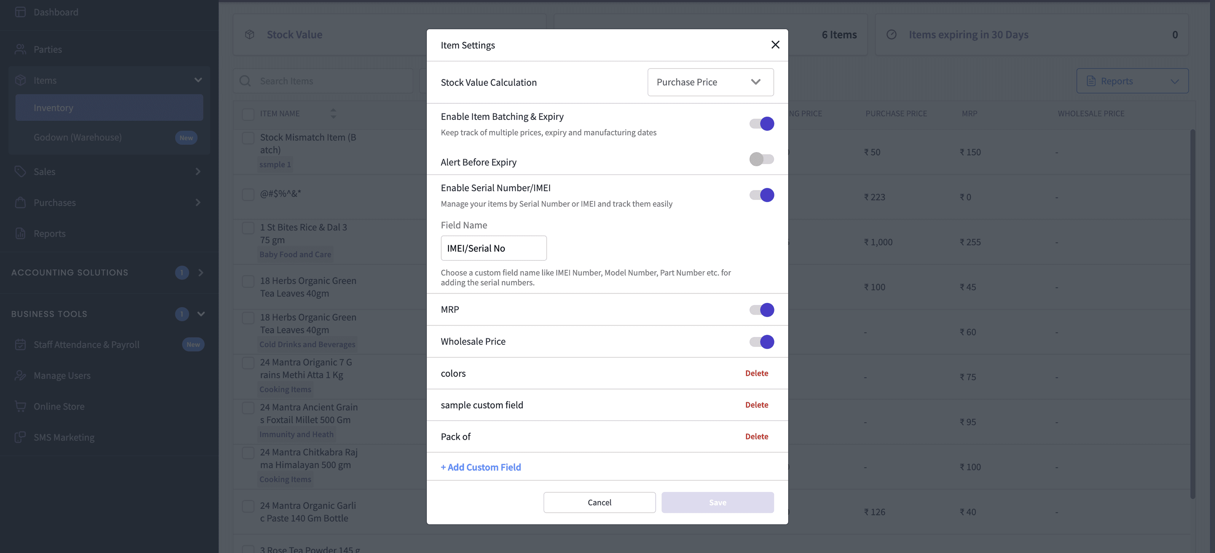
Items screen
The items table was hard to read once you had a large list, dense rows with no breathing room. We rebuilt it for readability and made it easier to select and interact with multiple items at once. Item details screen had turned into visual clutter as we kept adding features to it over time. We cleaned it up and kept only the elements with the highest click rate up front, tucking the rest away so they wouldn't get in the way of the main task


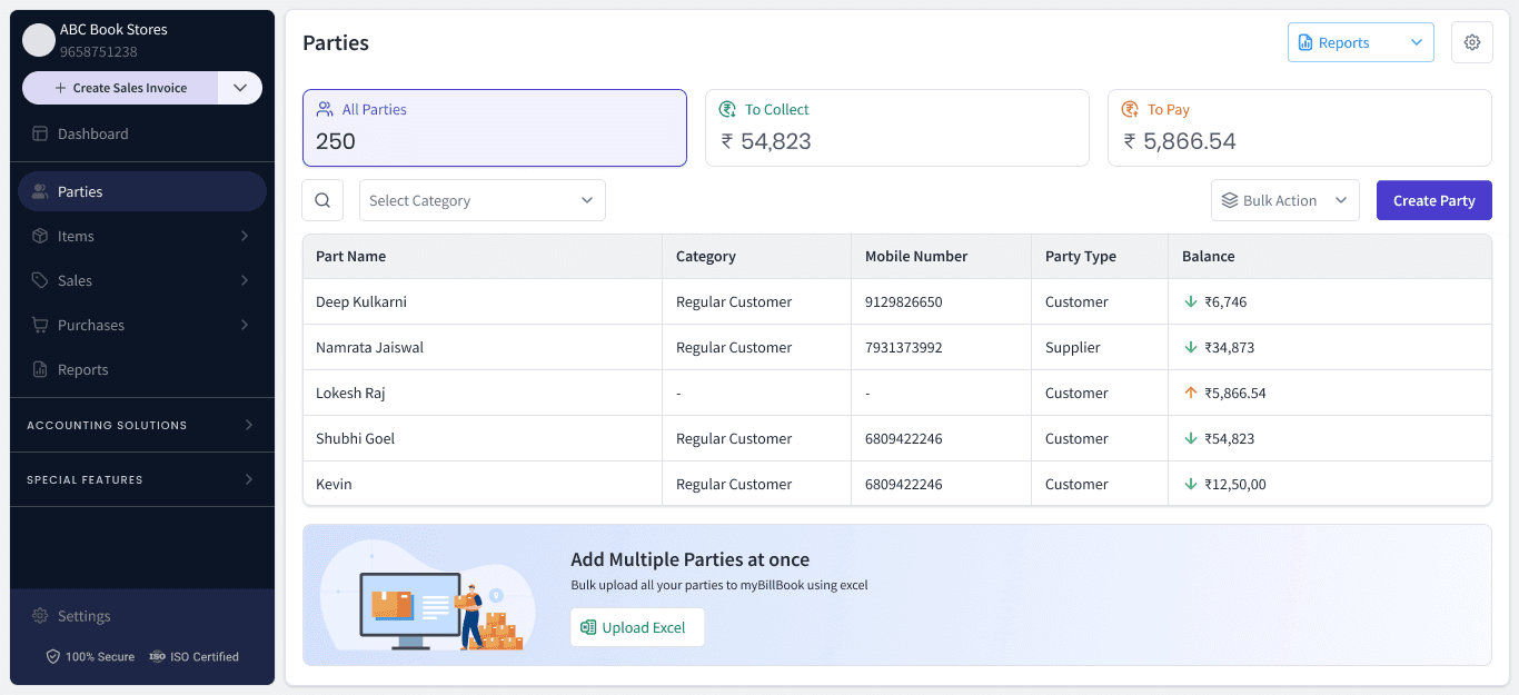
parties
This screen had the same problem as the items table. We decluttered it and made sure the information users actually needed was presented clearly instead of competing with everything else on the page.



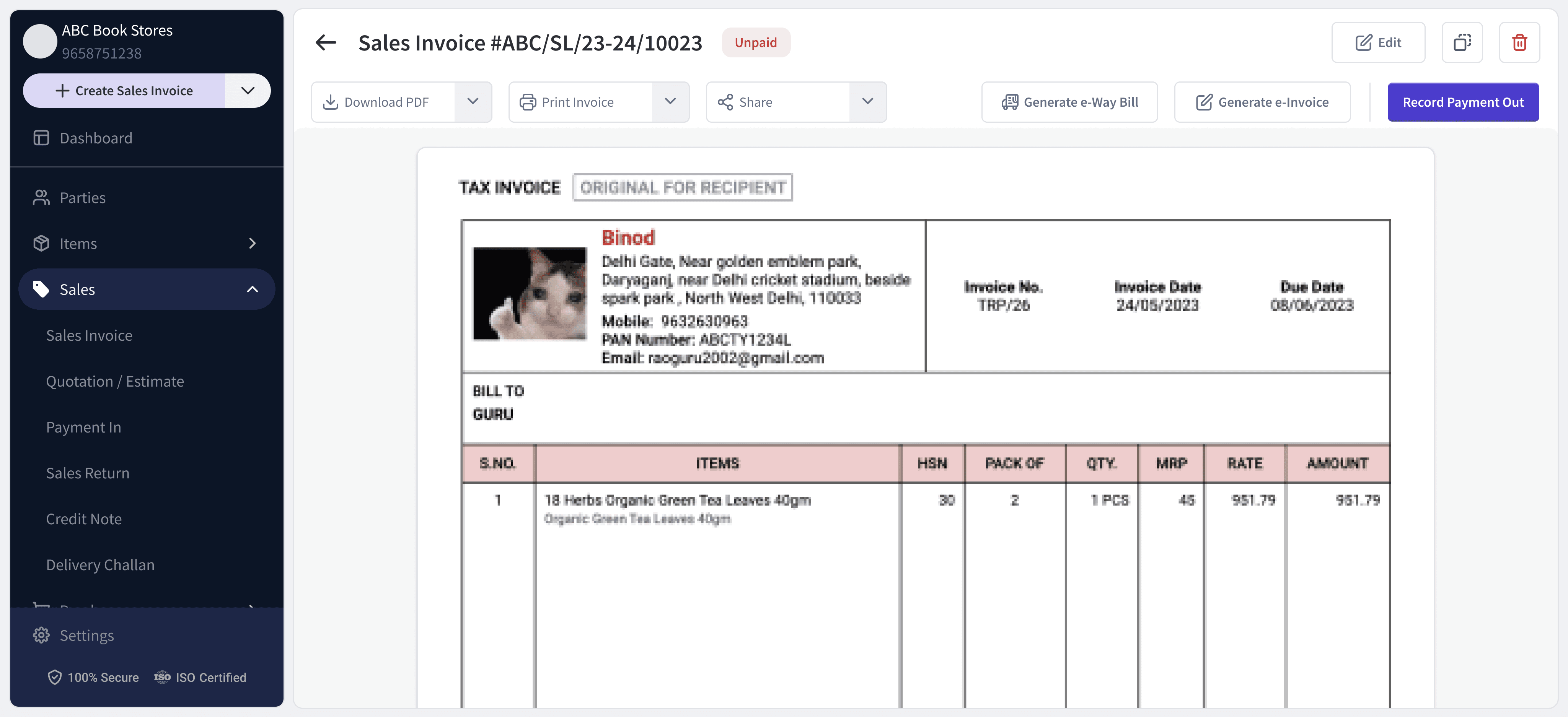
Sales Invoice
There were too many distracting elements on this screen. We measured how often each individual component was actually used and rearranged the layout around that, so what people used most stayed front and center.


Expenses
This was one of the screens that had ended up feeling thrown together over time. It now has a clear structure and is much easier to read at a glance.


Staff attendance & Payroll (SAM) and SMS marketing
These screens had gotten hard to read as more was packed into them. We decluttered the layout and improved readability across both.


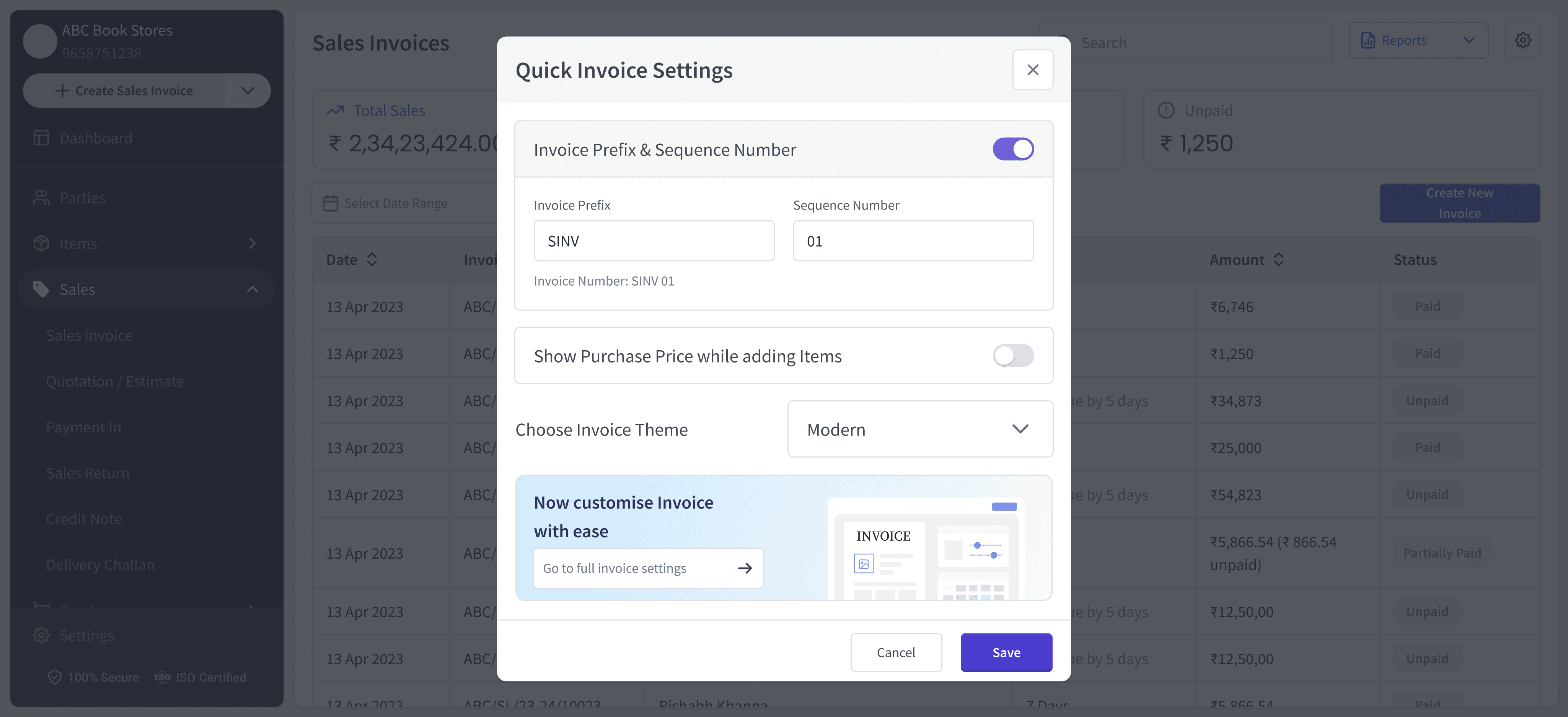
Modals
Based on usage data, we tucked away options that were rarely touched and kept the most-used actions front and center in every modal, instead of showing everything at once.


HABIT VS A REAL PROBLEM
The backlash that wasn't really about design
In the weeks after each stage rolled out, we got complaints. People said the old design was better. That was a strange thing to hear, we'd already spent a full usability round hunting down exactly this kind of friction, from the onboarding dead end to the discount confusion, and fixed what we found before any of it shipped.
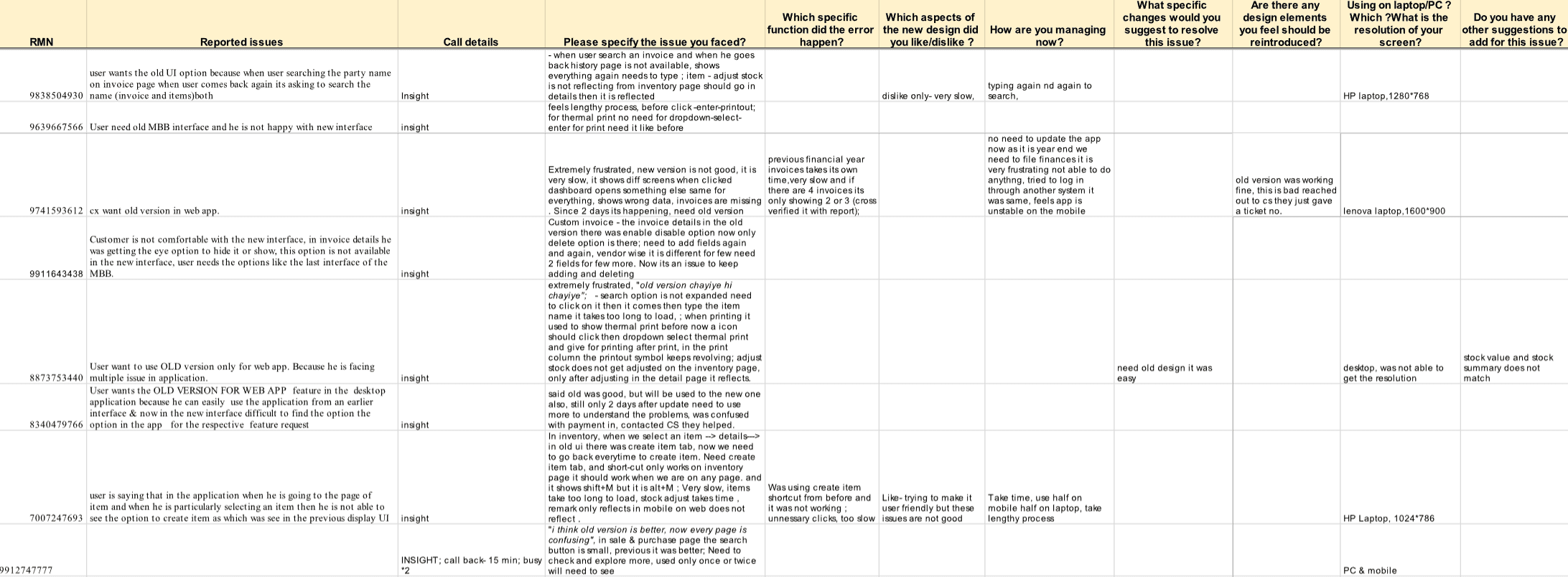
What it looked like: users reporting the new version was worse, harder, less familiar.
What it actually was: people used to the old patterns, reluctant to let go of something familiar, even when the new version served them just as well or better.
Why the distinction mattered: reacting to it as a usability failure would have meant reversing decisions that were actually working, based on noise instead of signal.
We kept an eye on how people were actually completing their work in the new flows, and gave it time instead of reacting to the first wave of complaints.
WHAT THE DUST SETTLED INTO
We could see our efforts pay off, one debt at a time
A few weeks in, the complaints thinned out and usage told a different story. The app was performing well. The friction had lived in the transition, not in the redesign itself.
The system kept paying off past that point. As our design team grew, it became genuinely hard to tell what was actually live in production versus what only existed in design files, some of the original v1 components had gotten carried into parts of the v2 redesign during the rush to ship.
The system gave us the structure to go back and untangle that, so files and production stayed in sync going forward.
Once the core flows were approved and stable, I handed the rest of the redesign to other designers on the team, each taking ownership of specific features and rebuilding them against the system. That was the real test of whether it worked: could someone other than me pick it up and move fast without me in the room.
It did.
— end —

